
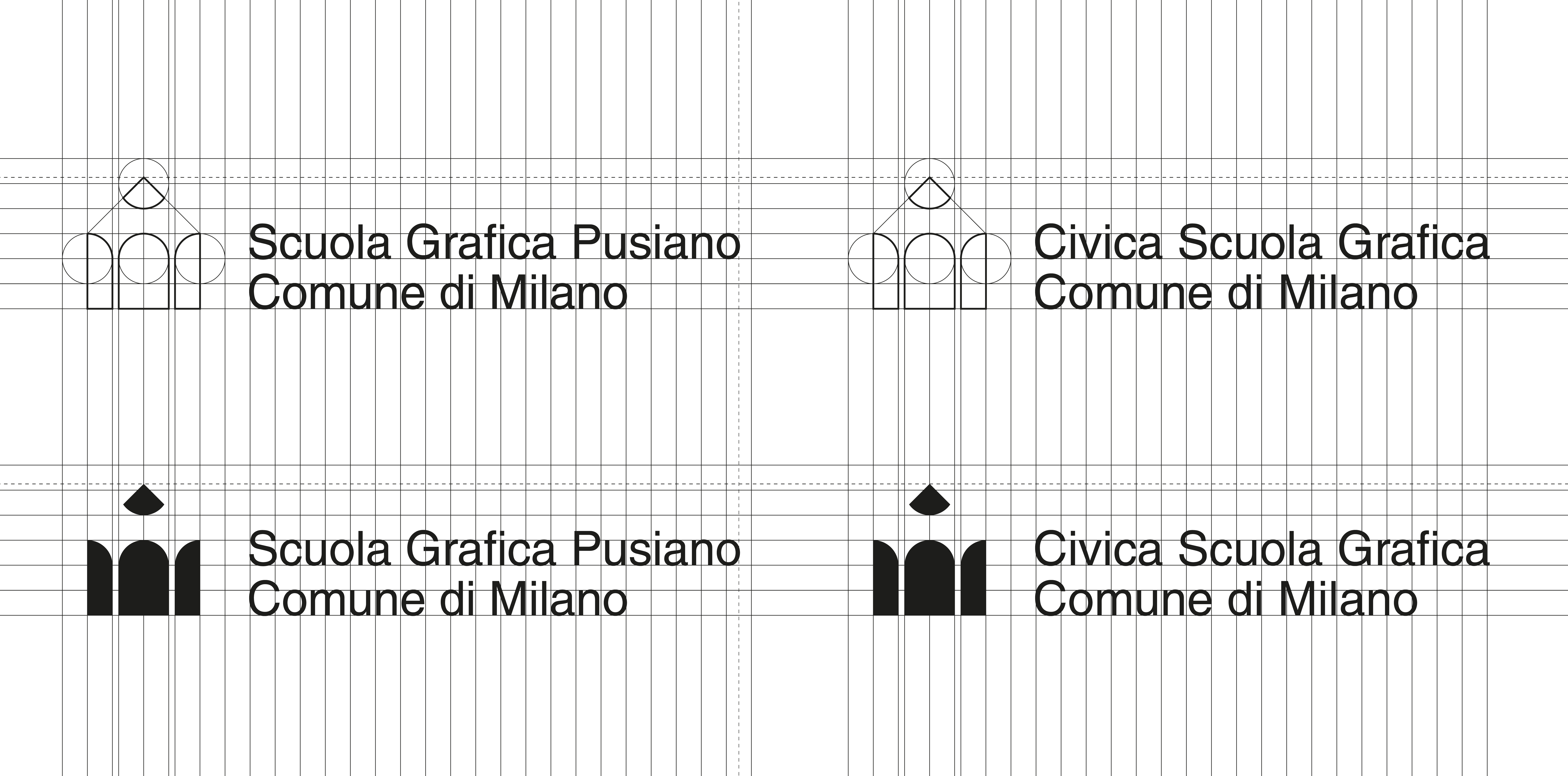
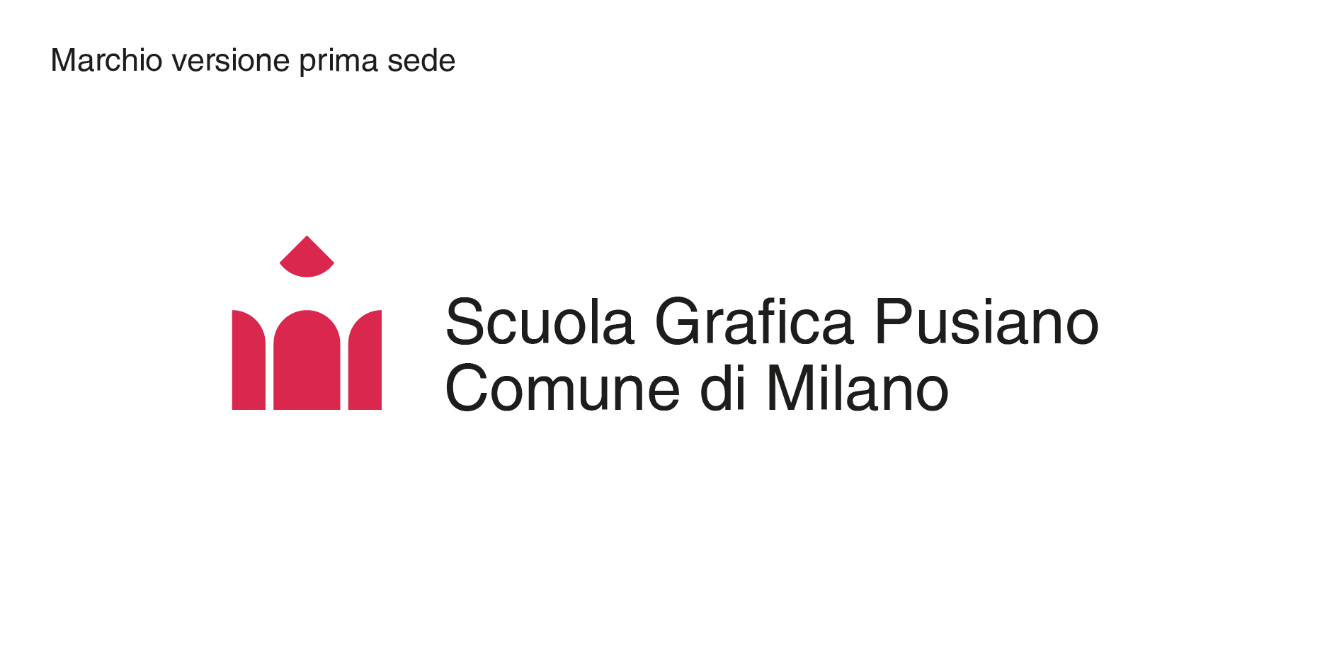
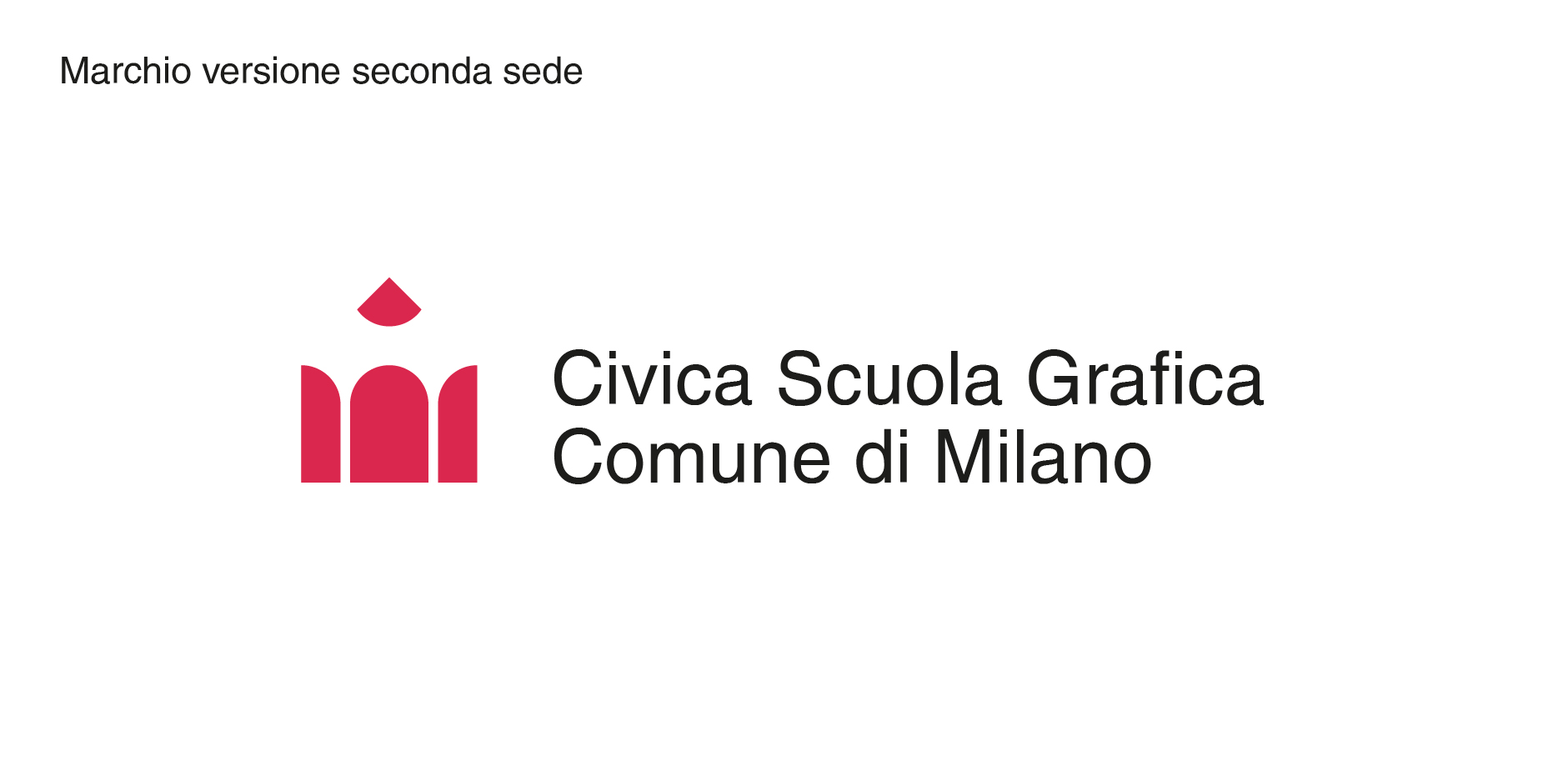
Trademark for a public graphic school of the Municipality of Milan – located first in via Pusiano and then in via Bottego, in the eastern outskirts of the city of Milan – structured with an educational offer that ranged from professional training (Graphic Design, Visualizing and Illustration) to in preparation courses for the Italian high school leaving exam.
The institution was founded as a supplementary public service in 1970, initially as a lower middle school. Since 1980 he has included graphic training. The school closed in 1999.
The new brand needed to communicate in a simple and explicit way the activity relating to “visual communication”, which had become the main training area of the school.
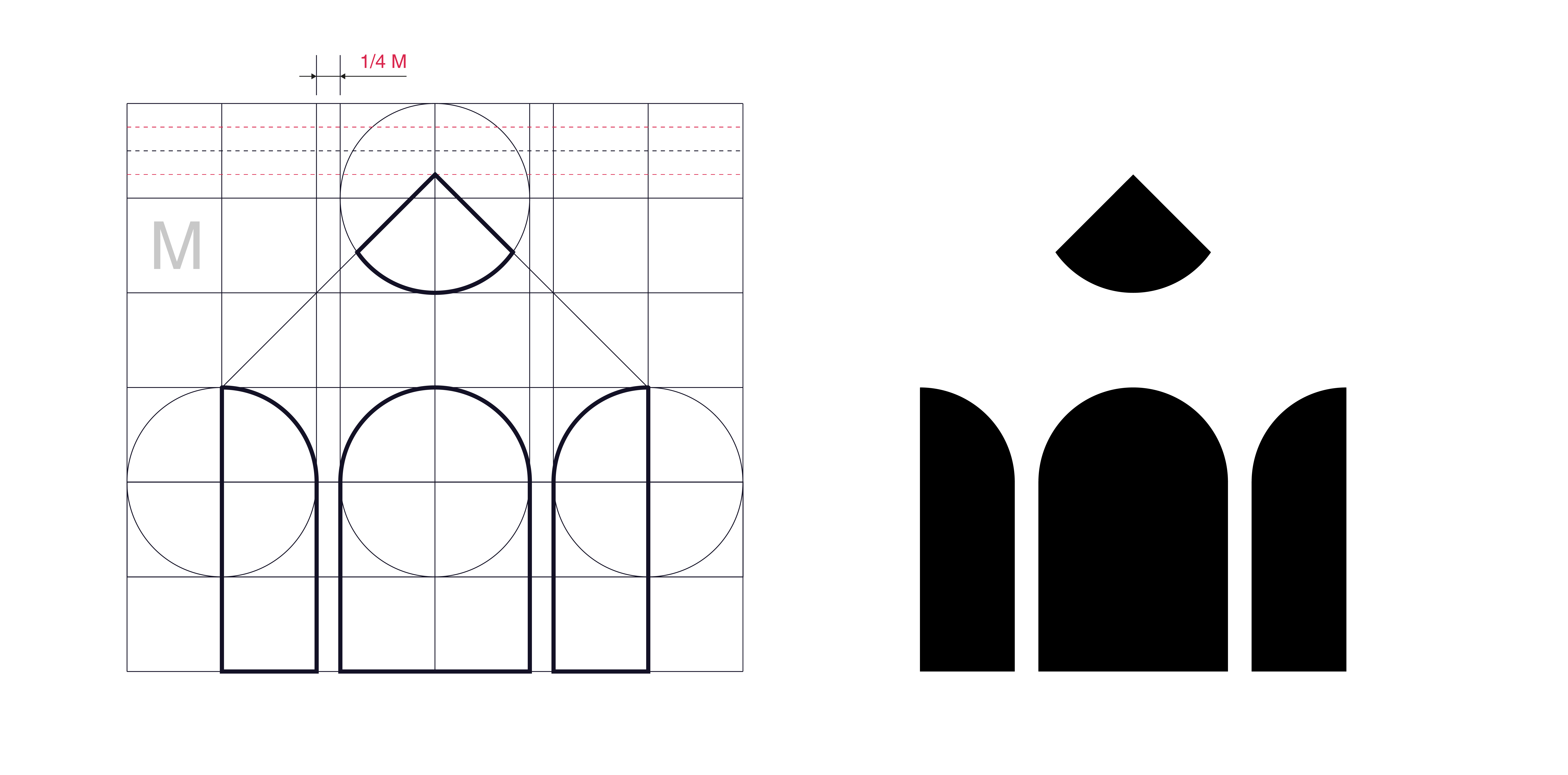
The subject of the pencil represented the most classic symbol of the graphic designer’s profession and with this extremely rational construction of signs, it allowed attention to be focused on the specialist approach, differentiating the school from the purely artistic ones present at the time in the Milanese area.
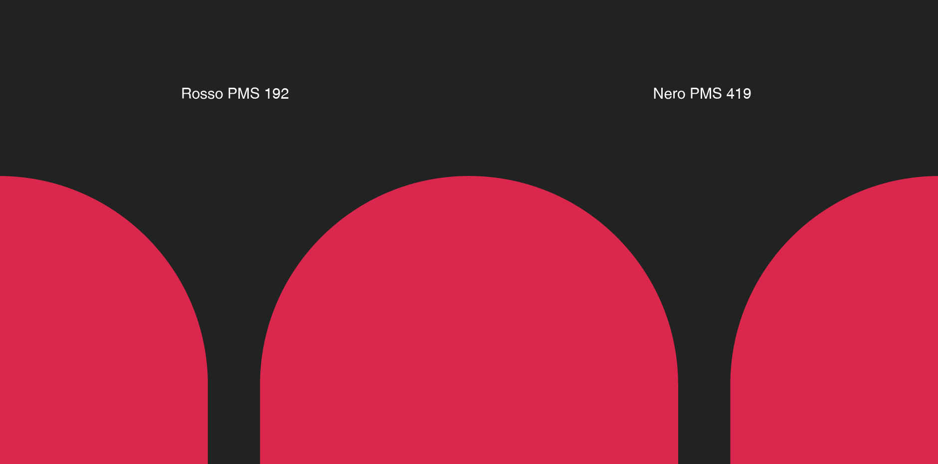
The chromatic identity takes up the colors of the city of Milan, but evolves the red with a fresher tone, as a reference to young people.
——
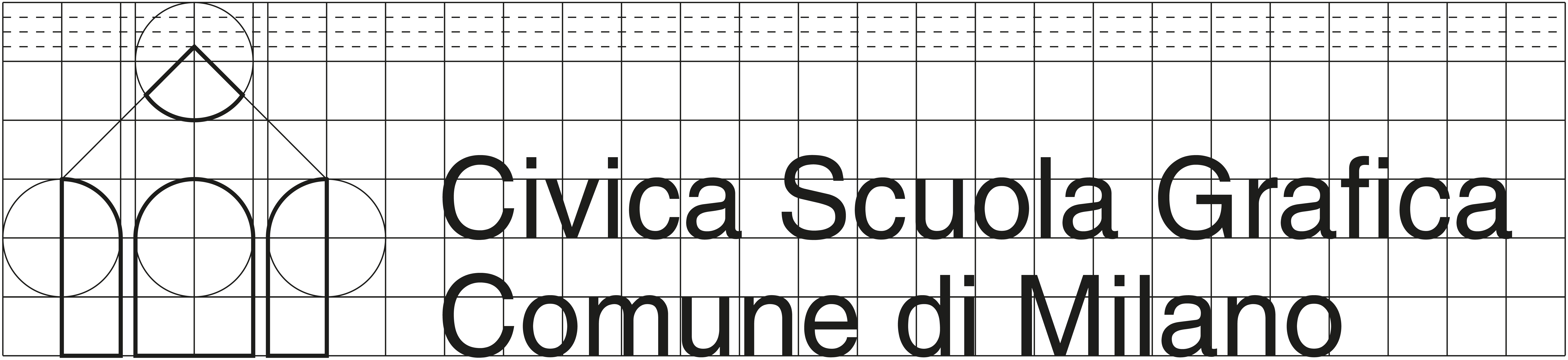
Marchio per la Civica Scuola Grafica del Comune di Milano – sita prima in via Pusiano e poi in via Bottego, nella periferia est della città di Milano – strutturata con un’offerta didattica che spaziava dalla formazione professionale (Graphic Design, Visualizing e Illustrazione) fino a corsi di preparazione all’esame di maturità nazionale.
L’ente nasce come servizio pubblico integrativo, nel 1970, inizialmente come scuola media inferiore. Dal 1980 inserisce la formazione grafica. La scuola chiude nel 1999.
Il nuovo marchio aveva la necessità di comunicare in modo semplice ed esplicito l’attività relativa alla “comunicazione visiva”, divenuta l’area formativa principale della scuola.
Il soggetto della matita rappresentava il simbolo più classico del mestiere di grafico e con questa costruzione segnica, estremamente razionale, consentiva di porre l’attenzione sull’approccio specialistico, differenziando la scuola da quelle prettamente artistiche presenti allora nel territorio milanese.
L’identità cromatica riprende i colori della città di Milano, evolvendo però il rosso con un tono più fresco, quale riferimento ai giovani.
Back to top