
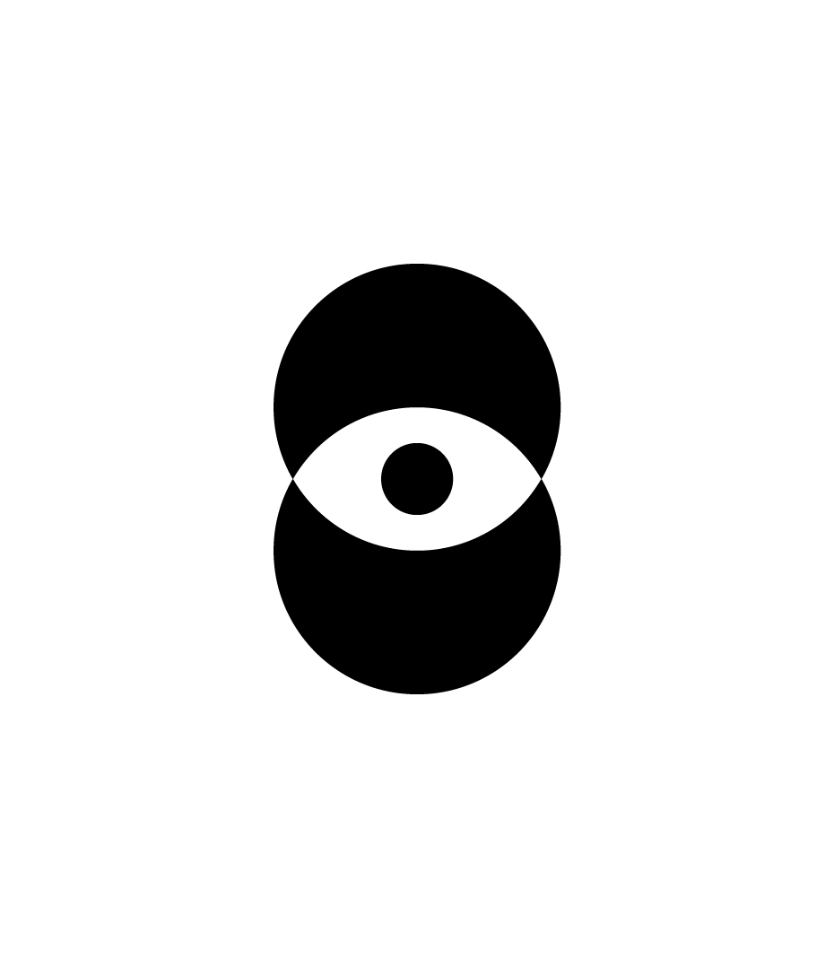


Trademark and visual identity for C1A0 Expo, the first trade fair held in Italy dedicated exclusively to Artificial Intelligence, organised in Genoa by Regione Liguria on 15–16 November 2019.
Univisual was commissioned to develop the entire identity system, from positioning and naming through to the brand mark design and its application across all communication materials.
C1A0 Expo is an international event aimed not only at industry professionals but, primarily, at the general public. For this reason, the identity needed to feel technical and professional while remaining emotionally engaging.
The naming — C1A0 (read aloud as “Ci-Uno-A-Zero”) — is alphanumeric in nature: the letter “I” is typographically replaced by the number “one” and the letter “O” by the number “zero.”
The result is a language that is both scientific, through the digits at the foundation of binary code, and empathetic, since the logotype carries an additional meaning through the visual reading of the friendly Italian greeting “ciao” — familiar and used worldwide.
The graphic symbol is composed of two circles which, overlapping on the vertical axis, form the shape of an eye. Through the use of orange, a double sun emerges in an ideal looping motion from dawn to dusk, evoking a sense of vitality, brightness and warmth.
When something is “sunny” it is not only lively but also clear and self-evident — hence the expression “as clear as the sun” — consistent with the explanatory logic and nature of Artificial Intelligence.
On a cognitive level, the eye as an ancestral icon with a hypnotic visual impact draws attention to the human element which, undeniably, must guide every form of artificial intelligence in service of the individual and personal wellbeing.
Formally, the combination of the eye symbol as focal point, the circular geometry, and a compelling name produces a logo that is both recognisable and distinctive.
—————————————————

—————————————————
Marchio e identità visiva per C1A0 Expo, la prima fiera realizzata in Italia esclusivamente sull’Intelligenza Artificiale, organizzata a Genova da Regione Liguria, dal 15 al 16 novembre 2019.
Univisual è stata incaricata di sviluppare l’intero sistema di identità, dalla definizione del posizionamento al naming, dal design del marchio fino alla sua applicazione ai diversi strumenti di comunicazione.
C1A0 Expo è una manifestazione internazionale rivolta non solo agli addetti ai lavori ma, principalmente, al grande pubblico. Per questo motivo era necessario sviluppare una identità tendenzialmente tecnico-professionale ma emotivamente coinvolgente.
Il naming sviluppato – C1A0 (da leggere, verbalmente, Ci-Uno-A-Zero) – è di una natura alfanumerica, dove nella composizione la lettera “I” è tipograficamente trasformata nel numero “uno” e la lettera “O” nel numero “zero”.
Si ottiene così un linguaggio sia scientifico (grazie alla presenza delle cifre alla base del codice binario) sia empatico, in quanto il logotipo aggiunge un altro significato al nome con la lettura visuale dell’amichevole saluto italiano “ciao”, noto e utilizzato in tutto il mondo.
Il simbolo grafico è composto da due cerchi che, sovrapposti sull’asse verticale, creano il disegno di un occhio. Con l’uso del colore arancione emerge un doppio sole in un ideale movimento in loop, dall’alba al tramonto, evocando sensazioni di vitalità, luminosità e calore.
Quando qualcosa è “solare” non solo è vivace ma è anche lampante ed evidente – da qui l’espressione «chiaro come il sole» – coerentemente con la logica e la natura esplicativa dell’Intelligenza Artificiale.
In termini cognitivi, la figura dell’occhio, icona ancestrale dall’impatto segnico ipnotico, pone l’attenzione sulla componente umana che, innegabilmente, deve guidare ogni forma di intelligenza artificiale al servizio dell’individuo e del benessere della persona.
Formalmente l’unione del simbolo dell’occhio, quale punto focale, la geometria circolare e un naming interessante, genera un marchio riconoscibile e distintivo.
Back to top